A few months ago (i just realized while typing it’s almost already a year ago) i took an R course to learn how it can help with data visualization, and i have to admit it has been quite useful even for my day to day where i am not specifically running analysis or data visualization on a daily basis.
During the course there was a sample dataset with movies released in the course of 5 years, with the budget for each movie, the audience rating, the critic rating, the movie genre and so on. A very well made dataset ready to explore and to derive insights from.
Of courese the very first learning point is that with a mare excel file without data visualization it’s hard to derive any insight from the data itself, and that is a fact i challenge anyone to fight against. More then ever it’s true that a picture is worth a thousand words. But how do we choose the best data visualization to use?

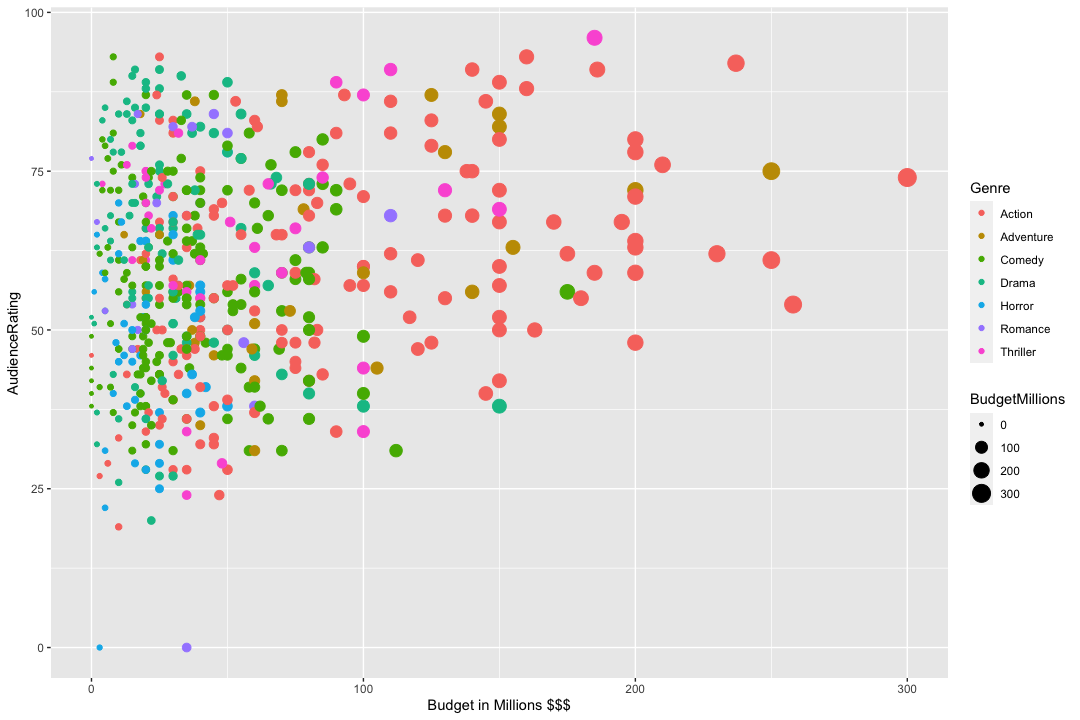
Scatter plots have been so far my favourite choice, as it can provide in the same bidimensional graph a moltitude of dimensions: for example you can choose to render on the X axis the USD$ budget spent for the movie, and in the Y axis the audience rating. You can then add colours to represent the movie genre and to help with the data visualization also the size of each datapoint could also represent the spent budget (so a big red point shows an expensive action movie, for example, while a small blue dot represents a low budget horror movie).
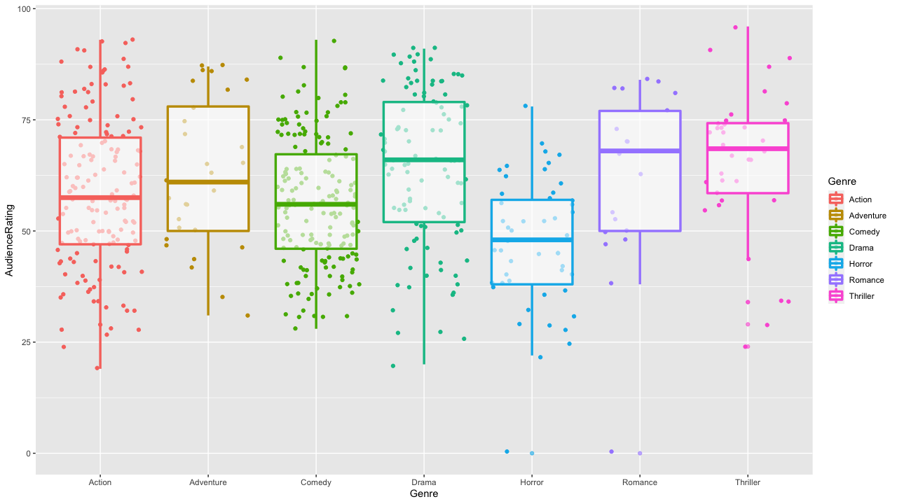
In another visualization we can choose to create different colums for each genre (while keeping the colour distincted for readability) and look at the median adience raging for each genre as well as the differnet quartiles, considering also outliers. this way we can immediately check which genre tends to be the most favourite by the audience and discover that horror movies have a higher chance to be rated lower then the other genres, and that while there are less thriller moveis (at least in this dataset) the average rating is much higer as the rating concentration in the mid quartiles is much higher, and so on.
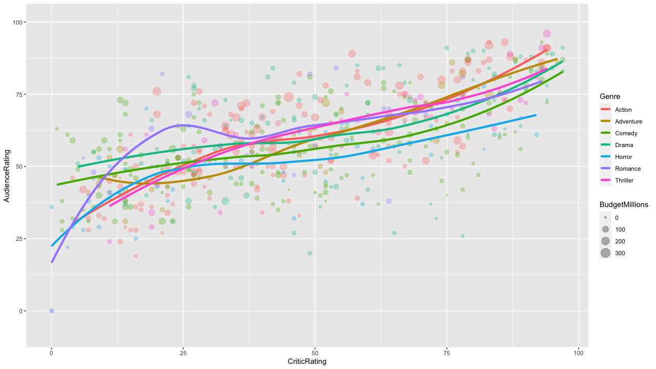
One of my favourite ones has been this that correlates the Audiene rating and the critic rating, with an added line to help reading the data. Here is the insight: critic rating is always more generous then the audience rating for low rating movies (otherwise the lines will be from 0 to 100 in a 45 degree angle). Look for example for the purple line. Romance movies seems to be more appreciated by the audience then the critics the higher the average rating is (the purple line angle is steeper in the low critic ratings range).
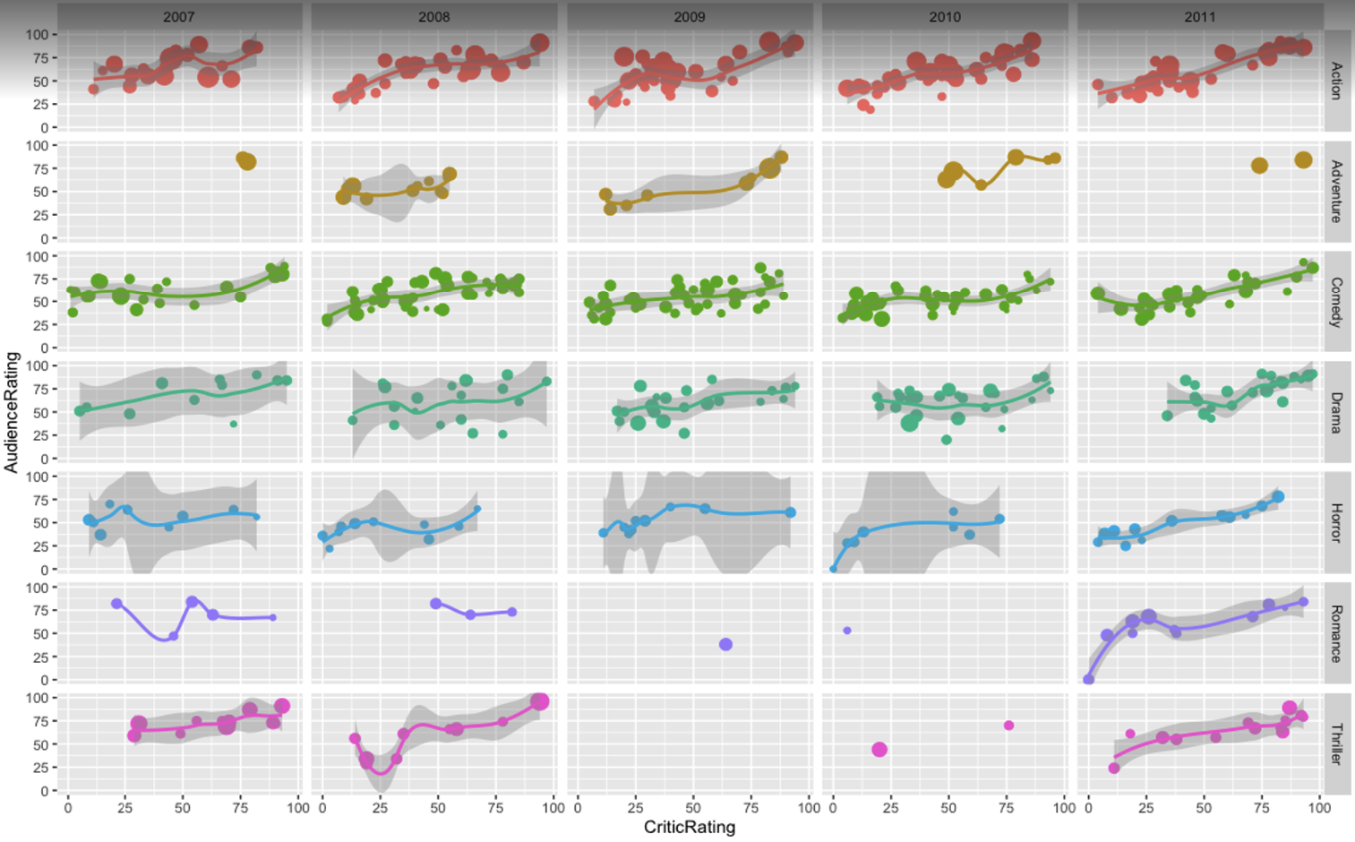
This last one summarizes the data above adding the year dimension (to see if there is any trend over time) and the insight is that lately adventure movies have been less chosen for production, and that 2008 has been a very bad year for horror movies critic ratings.
Now I want to share a bubble plot i made with sample data in Google Data Studio. This specific analysis shows a website’s top pages and uses multiple KPIs.
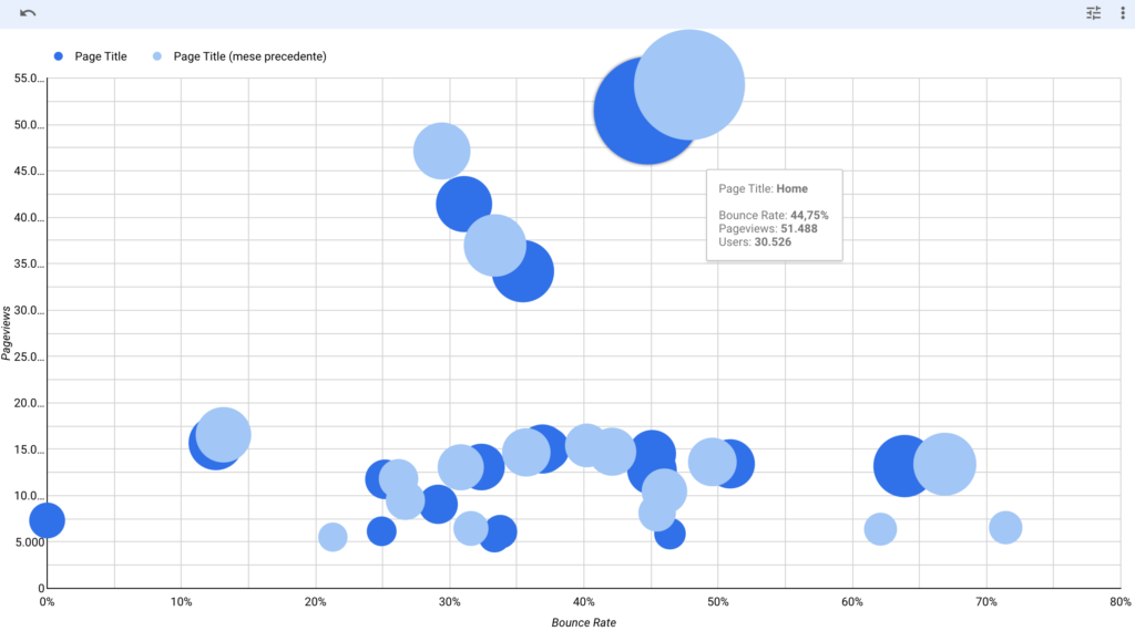
on he X axis the Bounce Rate of a page: the higher the bounce, the more the bubble representing a page moves to the right. So we want our bubbles to be as much as possible to the left of the graph.
on the Y axis the number of page views of a page. The higher the number of pageviews, the higher the bubble sits in the graph. So we want our bubbles to be as high as possible in the graph.
The size of a bubble represents the number of visitors on that specific page. So ideally also the bubble should be as chubby as possoble. if we spot a small bubble with a high number of page views, then it’s likely a small number of users have seen that page a lot of times (and depending on the page type it may be a good or a bad insight).
Then i’ve added a comparison: last month’s data is the blue bubbles, the previous month data is the light blue one. This means we can put the insight we find into the right context.
Let’s look at the homepage for example (the biggest bubble positioned in the high-mid quadrant): it shows that the number of page impressions vs the previous month slighly decreased, however also the bounce rate% has decreased a little since the blue bubble is more to the left then the previous month’s one. Other smaller traffic page had an opposite trend: those decreased the number of page impressions while increasing the bounce rate%.
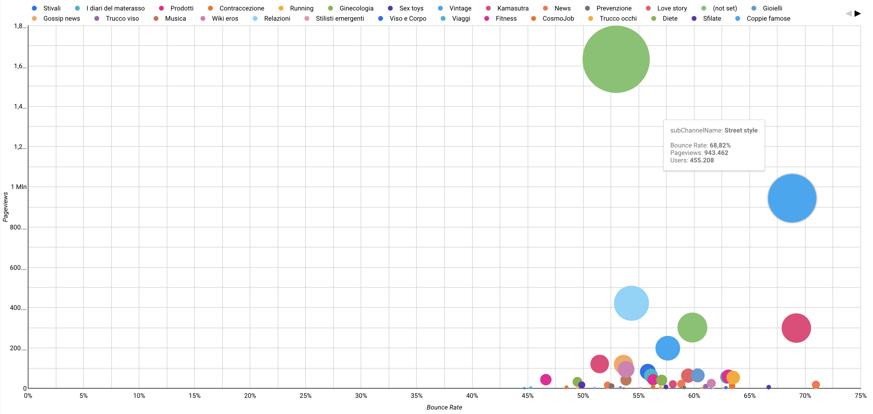
Imagine to run this type of analysis against a newspaper article pages, and to be able to add colours to the bubble, representing the Content Group of each page (so, yellow for sports articles, blue for politics, green for technology and so on). That way you will immediately sport trends and insights much quicker then analyzing data tables. Or even to be able to run the same data visualization against the content group instead of each single page. It would be even much more insightful in my opinion.
Data changes over time, so it is best when the data visualization we choose can represent the change over time. Previously I used DataStudio to compare a date with a previous one in a bubble-chart. In this example you can see that creating an animated gif rendering different years can help identify patterns much better. Here you see bubbles representing countryes, each bubble size represent it’s country population. The X axis shows the GDP per capita and the Y axis the live expectancy. Furthermore each country bubble is colored base on it’s continent, so that it’s easier to sport groups of country belonging to the same continent.
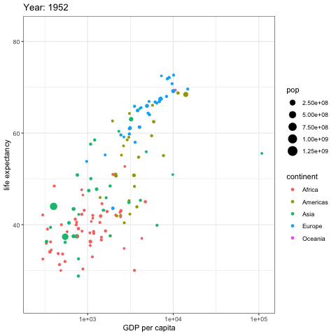
As you can see european countries increased the GDP and life expectancy, but what stands out is the pace to which asian countries have reached the european ones starting from way below the 50 years of life expectancy. The majority of the african countryes did not have any significative improvement of life expectancy and GDP, but the countries that did increase the GDP per capita also increased the life expectancy, but not at the same rate of european and asian countries.
And the insights that can be derived from this animated graph are even more, this was just the tip of the iceberg.
Another way to visualize data over time for multiple data-points is to use a heatmap where the X axis represents time development, Y axis the data dimension and the colored cell the data-point that needs to be analyzed.
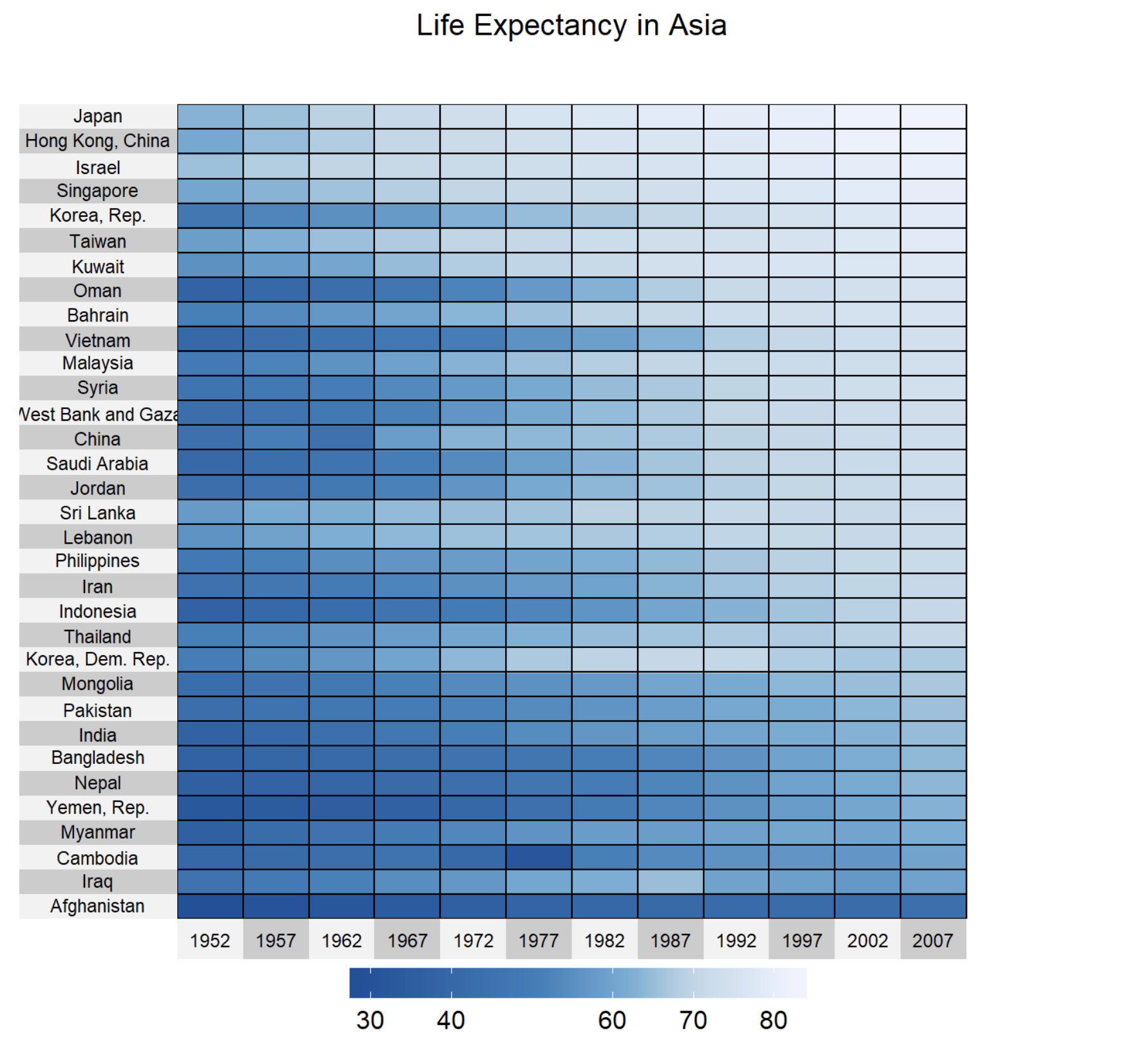
In the above example the life expectancy for each country has been rendered in different columns by year, so that we can clearly see the trend for each country and quickly compare life expectancy by looking at the “heat” of each cell. The nice thing about this type of graph is that the scale is shared among each country and each year. Look for example what happened in Cambodia between 1972 and 1977. Data patterns emerge so clearly. Afghanistan’s life expectency has been stady over the last 50 years, and we can clearly see that in the graph, as well as notice that it’s the country will shorted life expectancy overall. So by simply combining YEARS and COUNTRY as dimensions and LIFE EXPECTANCY as KPI, we obtain this insightful graph. Isn’t it great? 🙂
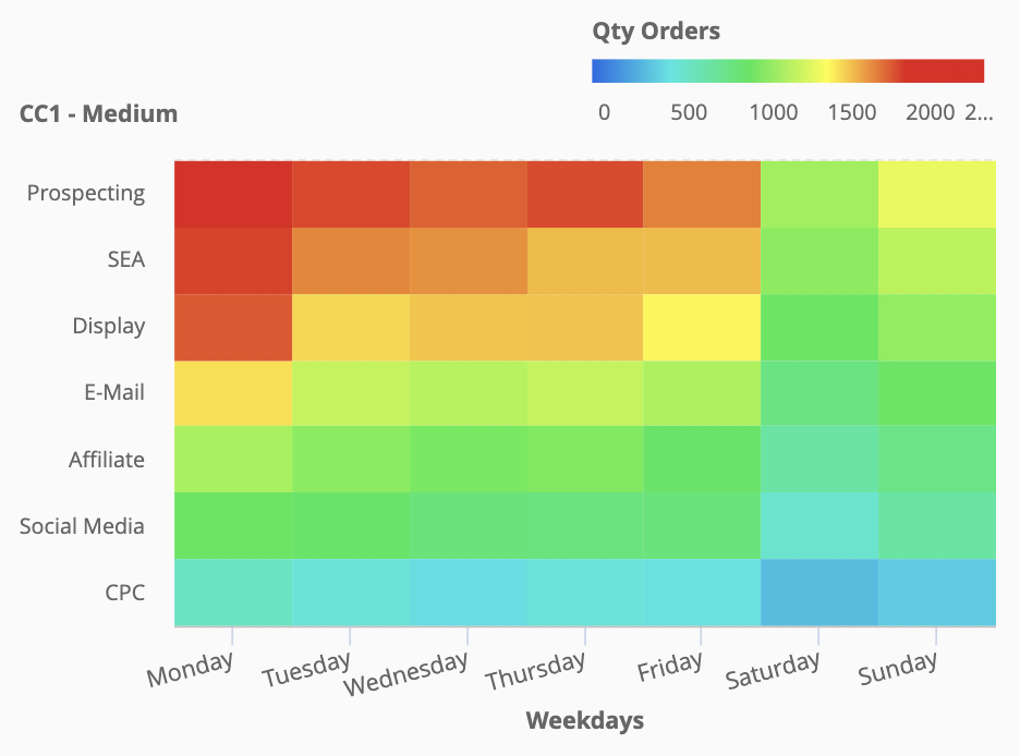
Another couple of examples creating time related heatmap graphs: the one above combines weekdays and Advertising Medium (campaign source) rendering the number of clicks from each one. We can clearly see which medium works best in each day (Prospecting) and that overall Mondays are the most attractive day for having people clicking on the related campaign medium. It’s easy to compare different medium in different days: for example email campaigns on mondays are as effective as Display campaigns on tuesdays. Saturdays is overall the worst day of the week to attract users to the website, and on Sunday, SEA campaigns perform as much as Affiliate campaigns on Mondays. Analyzing data this way also helps optimizing the Ad Spenditure for your Digital Marketing campaigns.
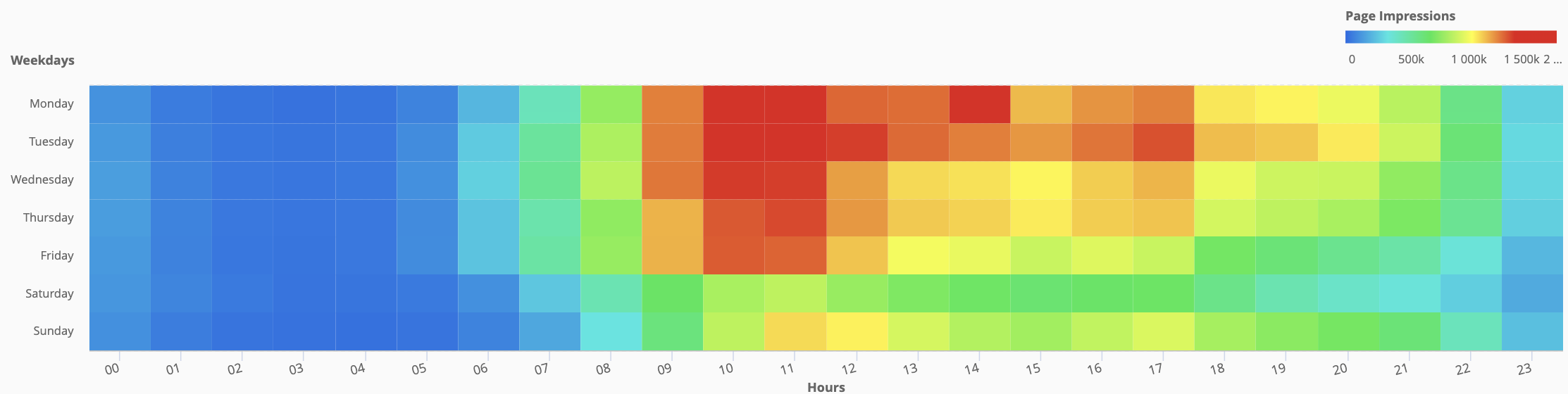
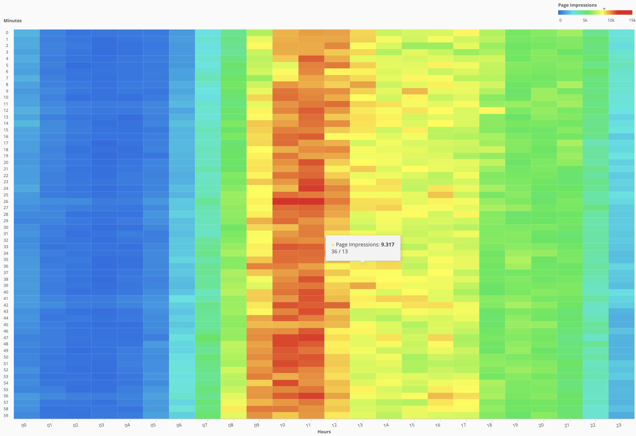
Last but not least, we can combine Weekdays with hours or hours with minutes to obtain a very straightforward heatmap for the needed KPI (in this example is Page Impressions, but it could be any metric/KPI: number of orders, Average Order Value, number of purchased products, number of users and so on.
Did i mention that Cross-Tab data visualization is among my favorite ones? 🙂
Behavour over time is a type of analysis that usually requires a time-series plot or a path plot to be fully comprehended (if not an anymation plot like the one described above).
Let’s assume we would like to understand which products our customers purchased over time. A path analysis of our dimension “products” should do, right?
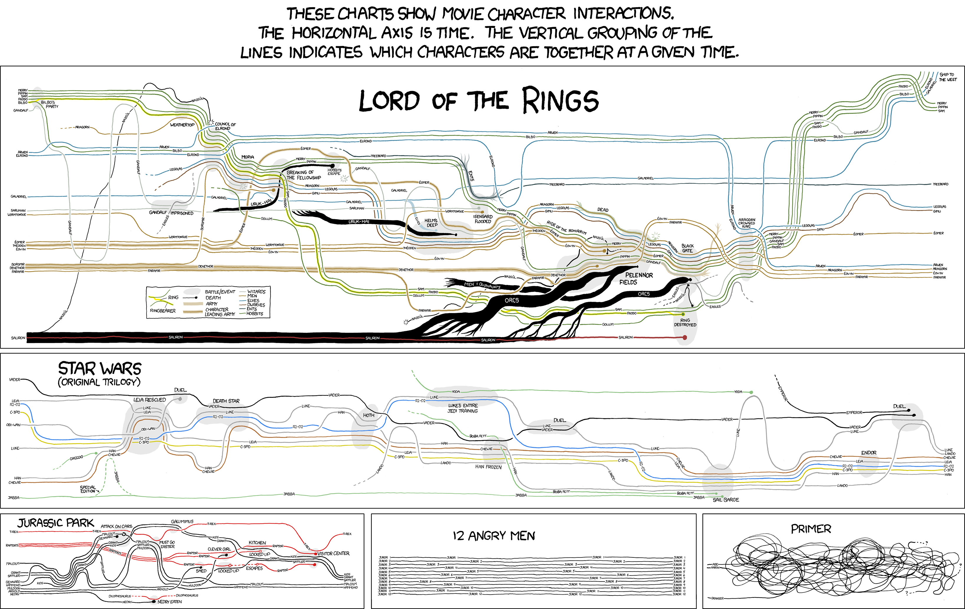
Nice, isn’t it? But wait, the, so called, “wow factor” fades away after a few seconds and something else pops-up: the “so what?” question. Just like trying to visualize the interactions over time of the movie “Primer”:
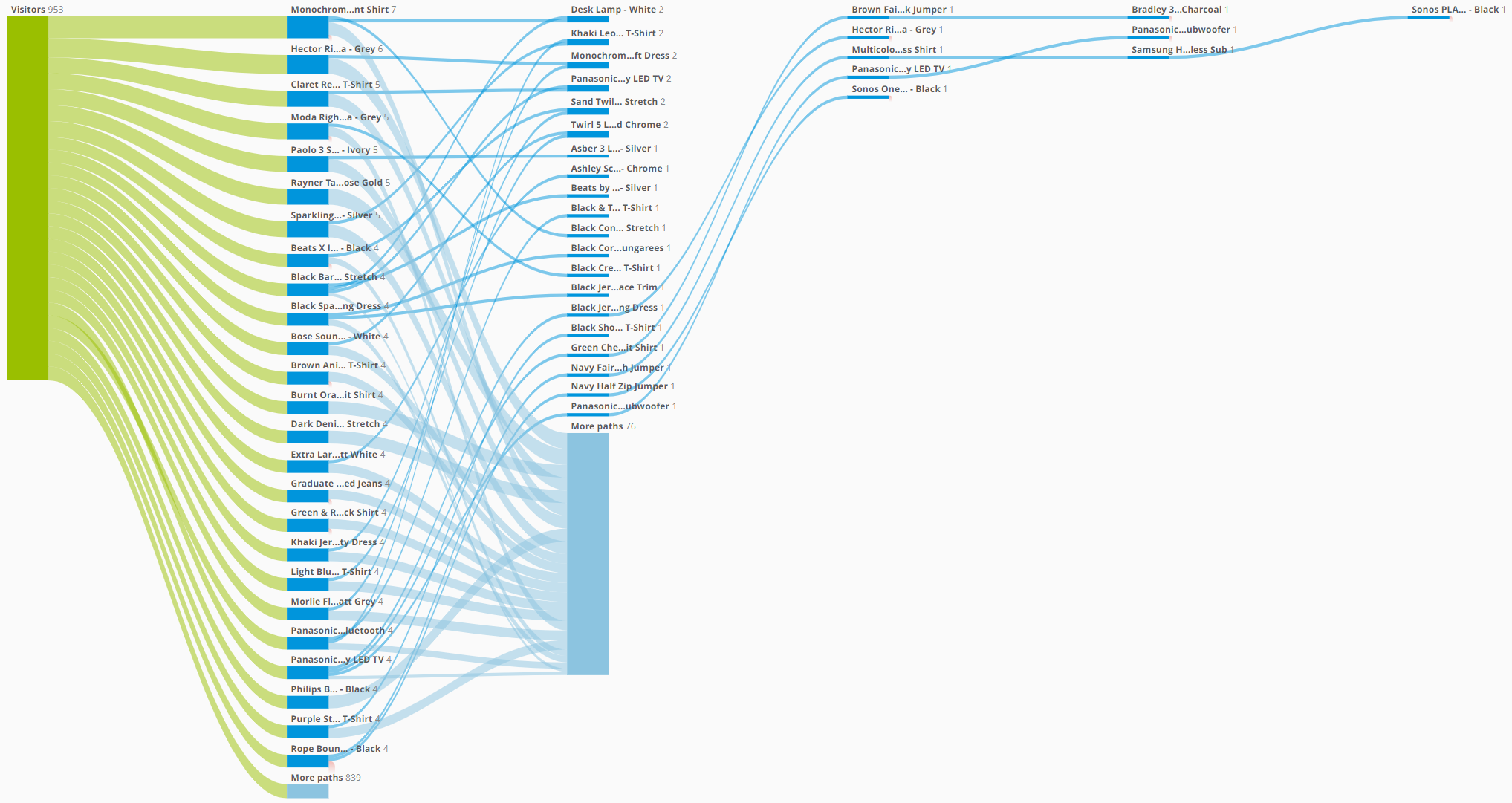
As we can guess if our product catalog is not limited to a few dozen products (and we have a decent number of customers) the granularity of this type of dataset can be overwhelming. And not many insights can be derived from this type of analysis. We should then roll-up to an higher level of analysis, for example if we are grouping products by categories, we could try to analyze the purchased products path by its main category or at least it’s sub-category. Here we go:
This is much cleaner: it shows purchased product categories over time by our customers, meaning that if customer A purchased a TV and then a TV stand, those 2 products fall into the same “step” of the path since belonging to the same product sub-category. We could choose to visualize those 2 steps or to hide consecutive steps with the same value. In this case i’ve hided the identical consecutive elements (meaning those 2 products are grouped into the same “step” of the path). This way we can easily segment and count the number of customers with similar product categories association (for example how many customers purhcase TV & Accessories and then Audio products?). Not only that: maybe we want to narrow down the analysis and include in the path only customer which in their lifetime purchased at least once a product from the category “TV & Accessories”.
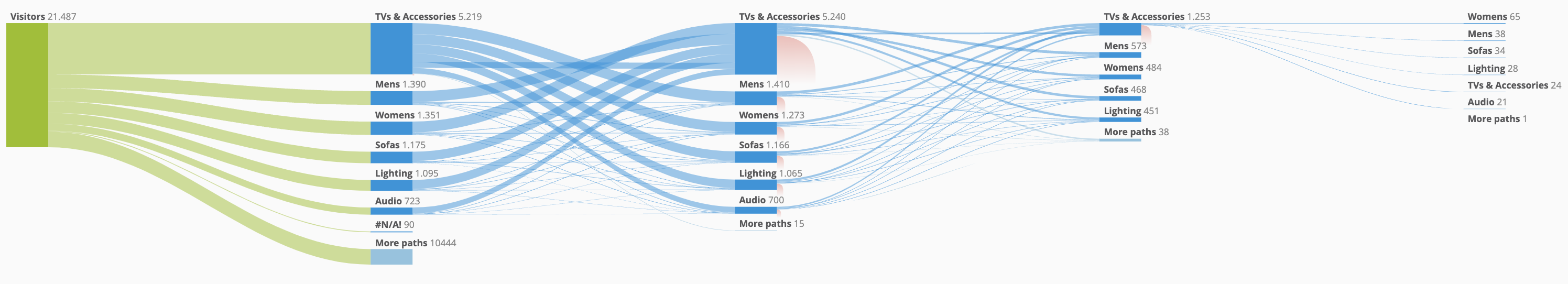
It’s very hard to spot patterns in this type of data, especially if the granularity is too small and we have so many data-points included in our analysis. Sometimes the dataset you need to analyze can be, counterintuitively, better understood with a simple data table.
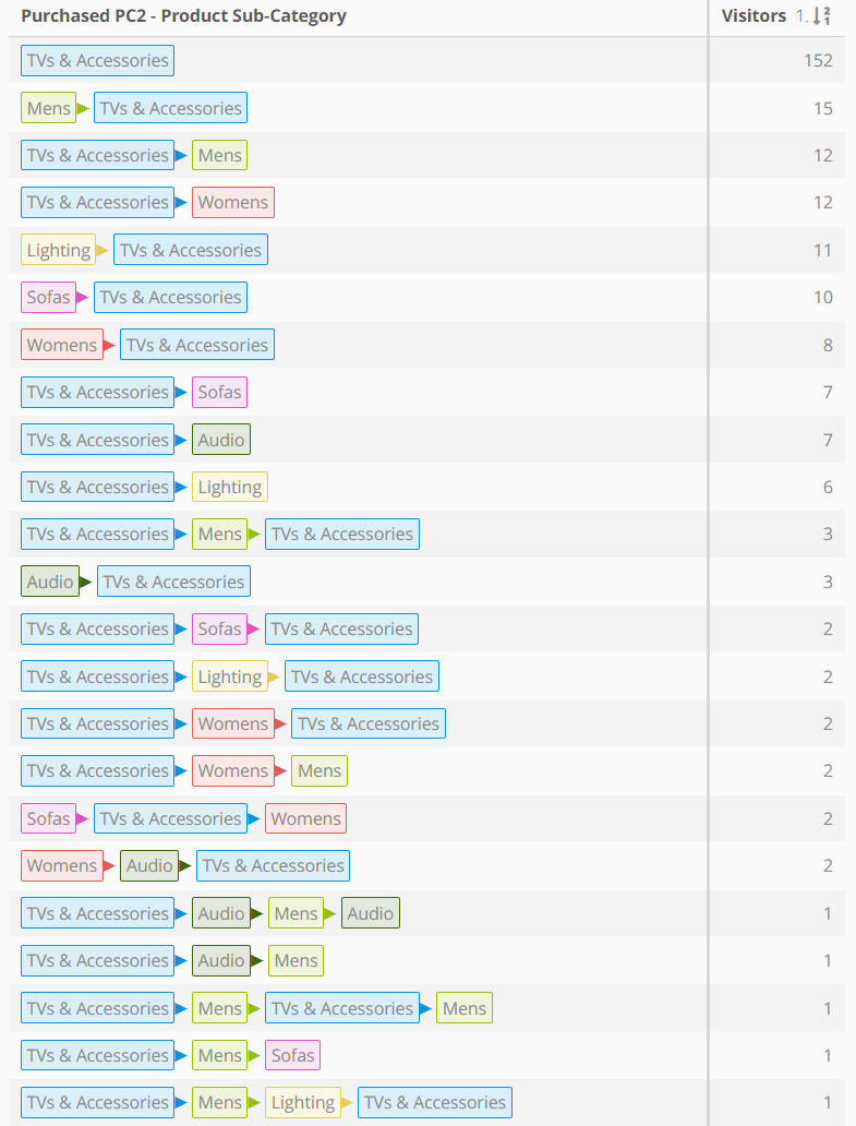
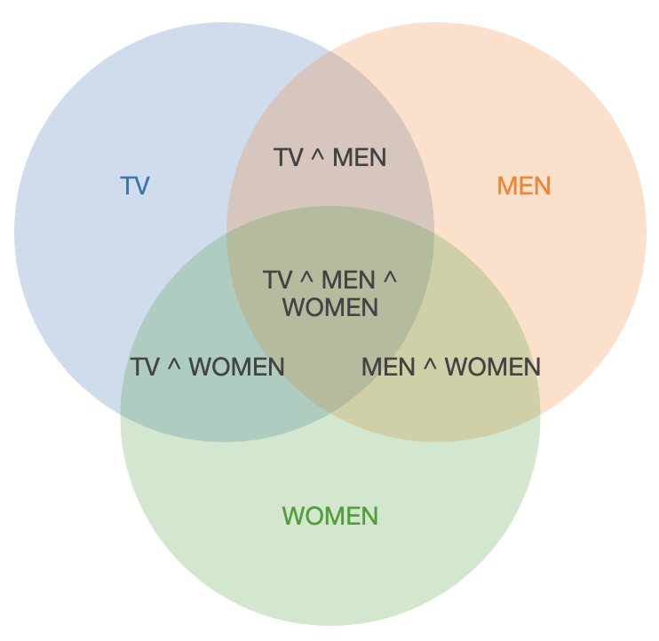
It for sure helps to have the different values color-coded so that it’s much easier to create groups and isolate patterns. Of course if you simply want to create clusters and do not care about the “path” it is much better to choose to work with Venn’s diagrams to represent segments overlap:
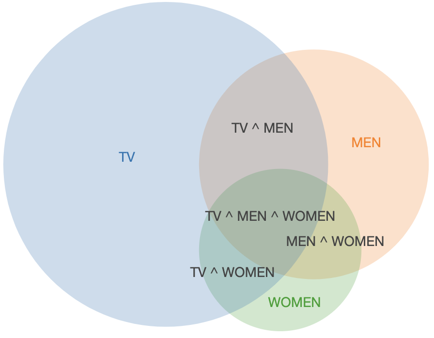
One reccomendation i can give when using Venn’s diagrams is to sacrifice the absolute values / sizes in vavour of the visualization, and add a legend for size reference:
A nice free web resource to create Venn diagrams from a dataset is this one.

Anyway, above i’ve breafly mentioned that granularity chosen for an analysis might have a big impact on insights that can be derived from a dataset.
The following stacked-columns chart has been rendered in Mapp Intelligence by counting the distinct number of visitors by Medium (derived from the utm_medium parameters used to track campaigns on our demo website) and grouped by hour of the day.
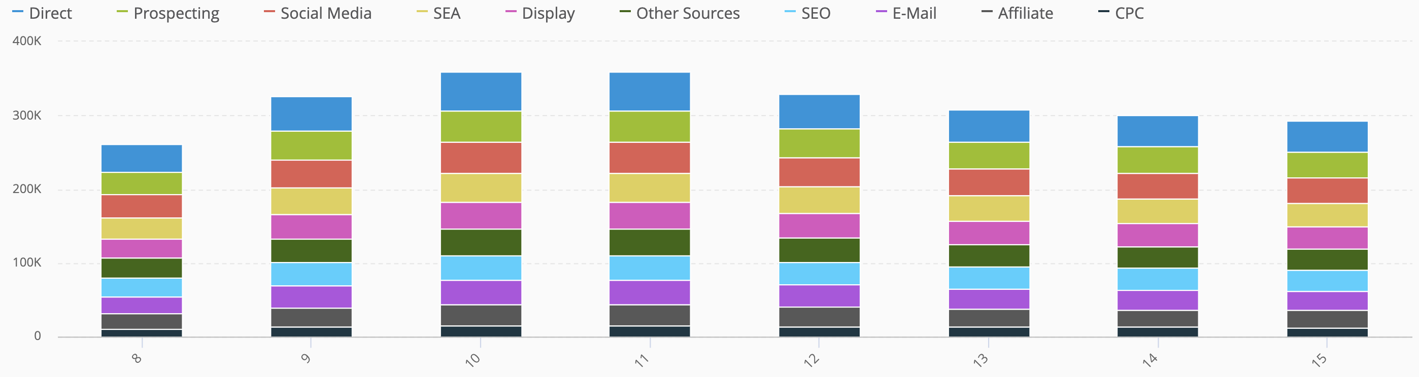
As you can clearly see the distribution in % between the different medium looks very similar each hour. But are we sure there are no changes within each hour? to make sure we take the right assumption we should simply stop making assumptions (:-)) and let the data speak for itself. So we can easily change the grouping granularity and switch to a minute-by-minute one, creating this way 1440 datapoints for each analyzed day, one for each minute of the day, and breaking it down by medium. The result looks quite nice (reminds me of a “magic carpet” somehow, very common within the TV audience reporting enviroments) and shows more details about the medium distribution within each hour of the day:
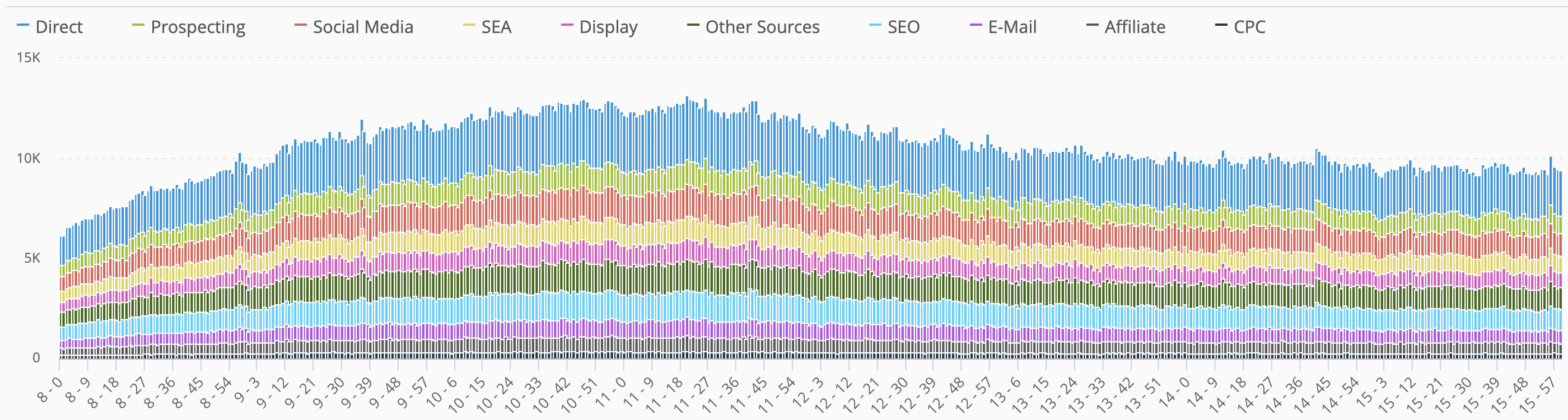
There are no major differences from the hourly aggregation, but at least we are sure we are not taking wrong decisions based on the assumption that the sample data we are anlyzing is not representing the real behavour on our websites.