In my previous post about data visualization I have focused on different ways to present a dataset, however a very important aspect that we always underestimate and do not consider as fundamental is the data preparation one. It is widely known that a data scientist spends most of his working time preparing data (a safe assumption is that around 80% of the total time is spent executing data preparation tasks).
So i wanted to verify this by going through a practical exercises. I had first to find a nice dataset to work with. Lukyly i have an iPhone where i’m keeping track of my daily weight since late 2014 so i thought it would be a good exercise to see what i could do with that data i already have (and own).
fisrt i had to export the data from my phone (data gathering task, aka collecting the datasets).

The iOS health export generates a ZIP file with all my Health data: a big XML file that contains a lot of not needed rows for the purpose of this specific data-crunching exercise. I do not need the steps, nor the run distance, I just need my daily weight.
The first choice i have to make is: do i need to prepare all the dataset or should i create a subset to work with? it all depends on what i plan to do in the future. Will I only ever need my weight data or maybe tomorrow i will need to look at, say, steps per day for running a cross analysis later? For the purpose of today exercise i will only keep the weight data.

Looking at the XML file we first need to understand the label of the weight data we need:
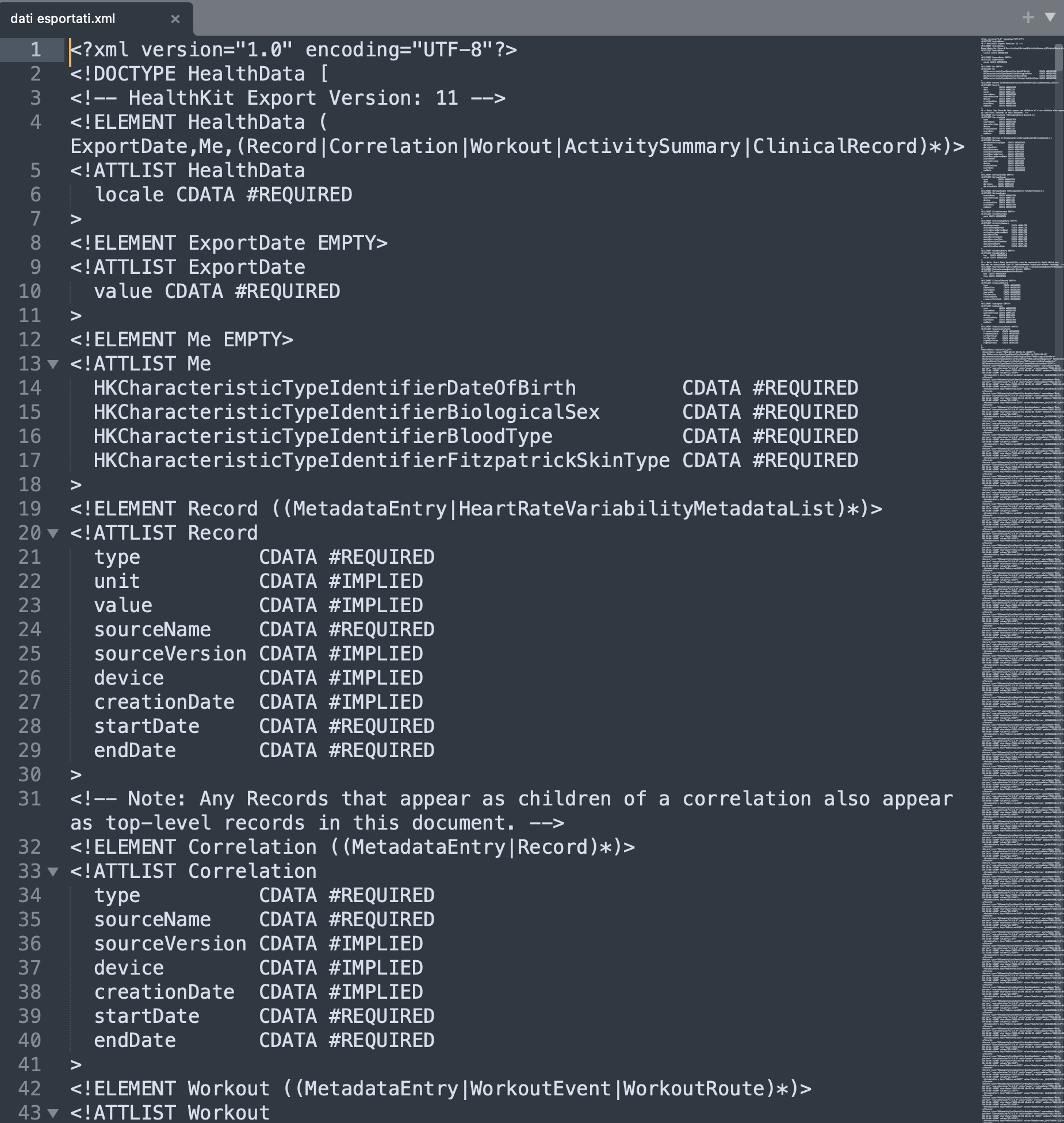
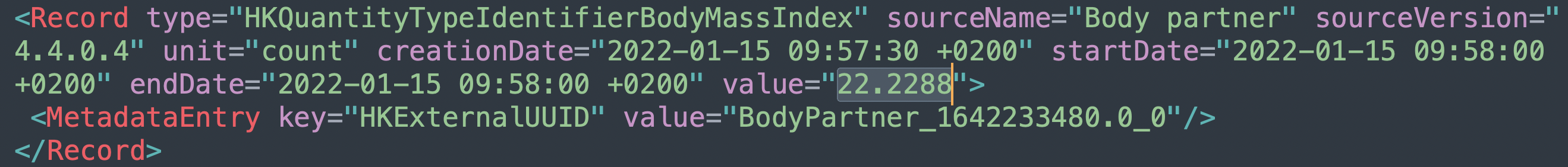
the “HKQuantityTyoeIdentifierBodyMassIndex” is not the weight but the BMI (Body Mass Index), so we are lucky that the label is verbose and we can easily understand the data it contains. If that was not the caee, we could explore the data and try to guess the data type from the value itself (and in this case notice that health stores the BMi with a percentage with 4 decimal digits).

Scrolling down we then spot the “HKQuantityTyoeIdentifierBodyMass” (was it too easy to simply call it “Weight”?). This is the values we are looking for. But how do i convert XML data into a more portable and compatible CSV format? It is a simple matter of googling the right words, maybe someone has already faced this specific problem and there is some documentation out there waiting to be found. So i came across the website https://www.ericwolter.com/projects/apple-health-export/ that allows to upload the xml just exported from my iPhone health app and convert it to CSV. You can even select which data you are willing to export:

in a matter of seconds the browser downloads the CSV files. I don’t really care about the privacy of my health data, but if i was i would be careful to upload files to 3rd party sites. Anyways, here is the final size of the converted data that is needed:
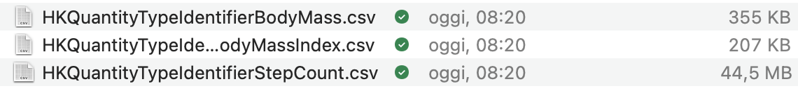
The biggest dataset is the step count file, but as explained today i want to focus on the weight, so i need the 207K byte csv file. It contains all my weight dataset from December 11th 2014.
Now we need to transform and enrich the data according to the type of analysis we want to run. In my case i would like to understand from the data if there is a correlation between my weight and the day of the week (i have an idea that i want to confirm with the data). Am i eating more during weekends? this would emerge as a pattern if, for example, i notice that the average weight on mondays is higher then the other days of the week. So in order to run this type of analysis i need to have a date field but also a weekday field. This information can be easily added with a simple excel formula:
weekday().
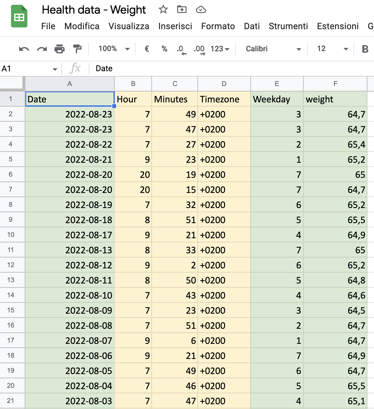
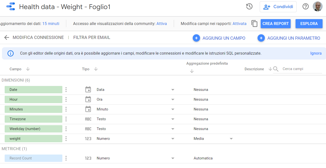
Here is the Google Sheet i’ve amended from the CSV output generated with the XML converter. https://docs.google.com/spreadsheets/d/1IIny5ScoEDrExtnsuhfg62lo69tNkwxhDKd9cqz4OVk/edit?usp=sharing. Since i don’t want to focus my analysis on the time of the day (that’s when i used the scale to weight myself, but it would include some more datapoints that maybe at this stage of my analysis are not really needed, so for the moment i’ll skip this data). Timezone is a redundant data since it’s always the same. So the columns i’ll need are the ones in green:
Now that I prepared the dataset, i can choose the viz tool to be used. Since i have a Google sheet it’s kind of straightforward to use Google Data Studio. So now we can move to the Google DataStudio front end and prepare our dataset, creating a new data connector, the CSV one in my case, and defining the data types:
It is important to notice some facts from our dataset: there are missing datapoints (some days i am not at home so i don’t weight myself at all) and there are some days where i weighted myself multiple times in the same day. So we need to keep this two facts and configure the dataset and the data visualization accordinly. For example we don’t want the analysis to SUM the multiple weights on the same day (otherwise the total weight will be the double as the real one). We can choose to create an average between all the values for the same day, or we can take the lowest or highest value, or even choose to consider only the first data of the day); also we want to make sure that during the data visualization phase, missing data is taken into account, eigher by not including the missing days, or interpolating the data from the existing datasets.
Google Data Studio offers the ability to choose the default aggregation type for our weight dimension, so we can choose “Average” instead of sum (“Media” in my italian language version). We’ll take care of the missing datasets later on when we define the chart visualization options:
So, fast forward skipping the dashboard preparation (since this post is about data preparation) let’s see if we can get an insightfull dashboard: https://datastudio.google.com/s/uCrKw98vy_Q
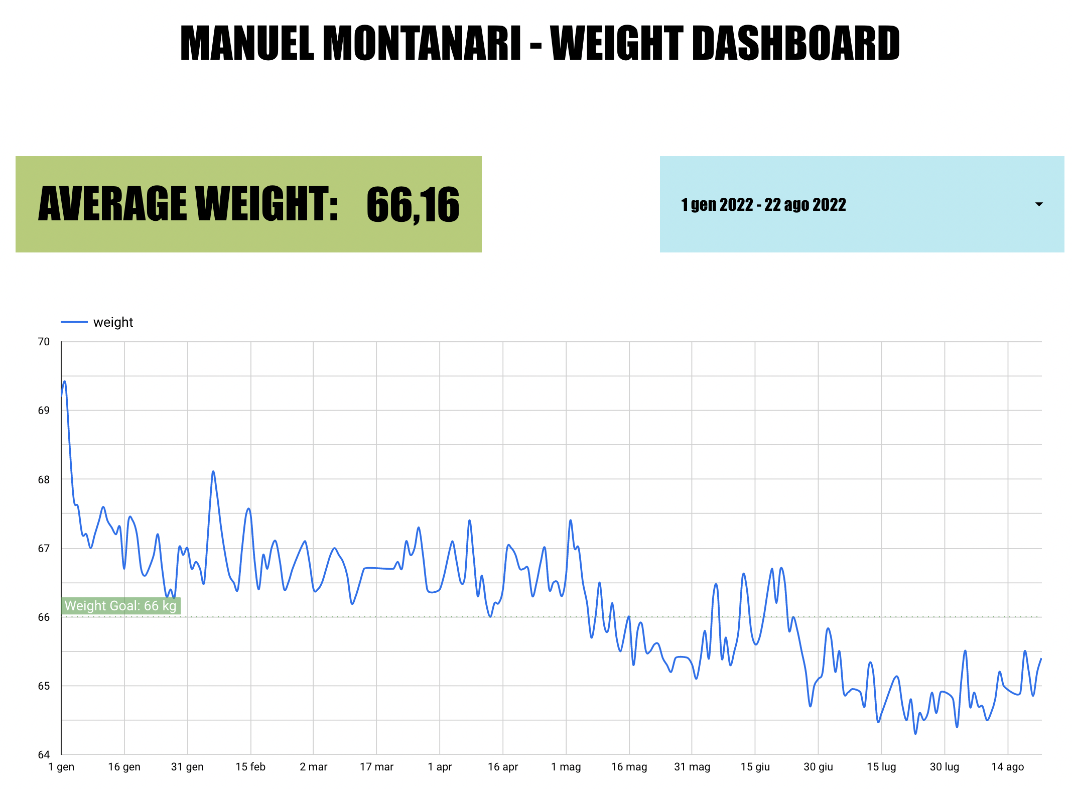
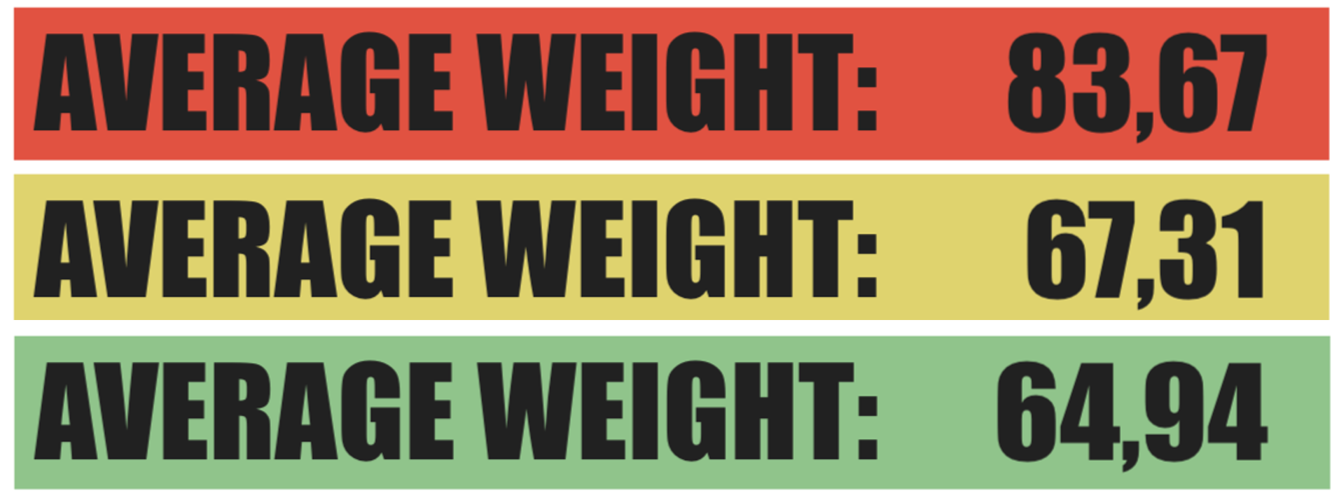
What I’m very happy with: the average weight KPI that shows the average weight calculated dinamically for the selected time period, and uses different colors depending on the value:
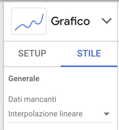
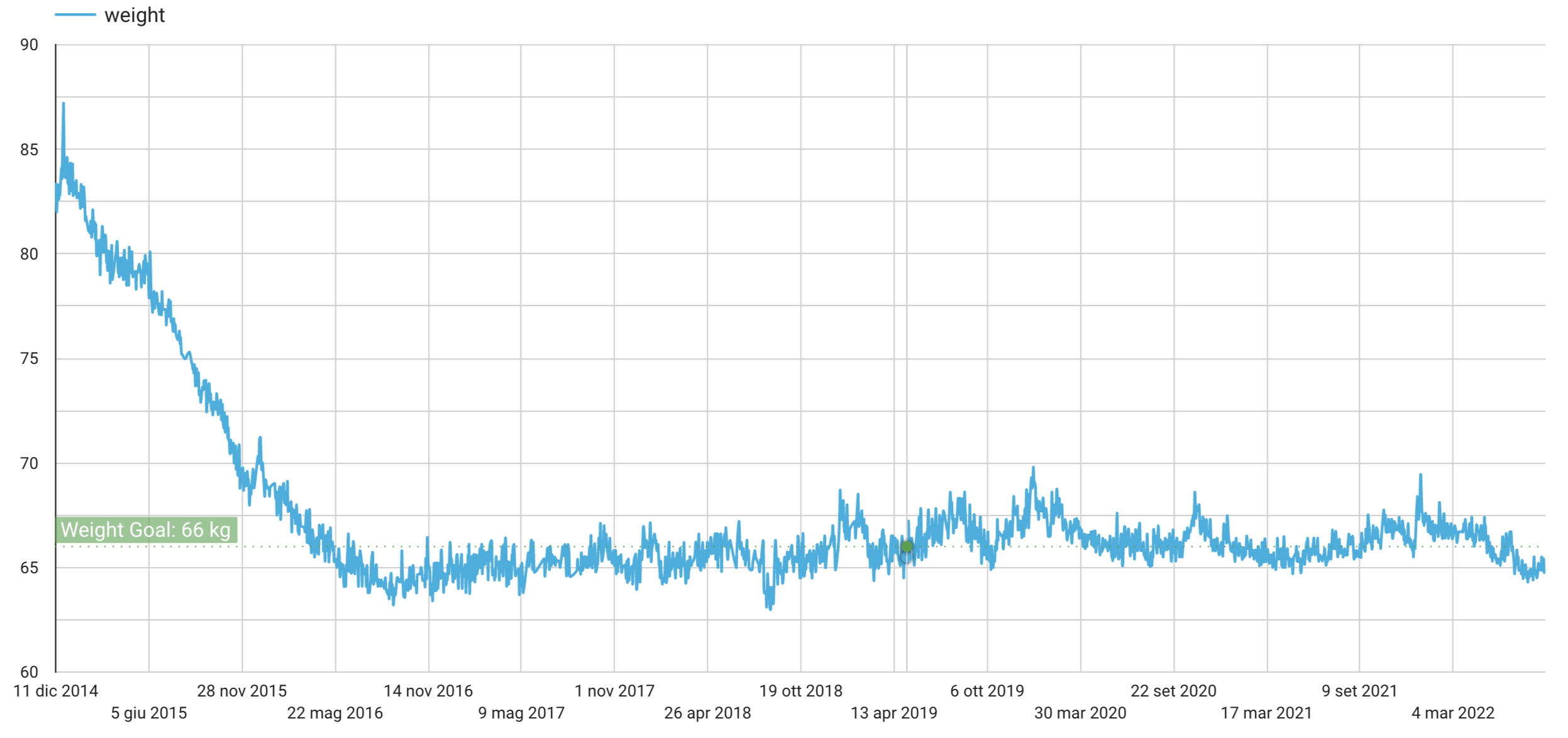
I’m also happy with the daily trend visualization, that eliminates the missing data points with linear interpolation, showing a nice uninterrupted trend line, with a goal weight line as refernce:
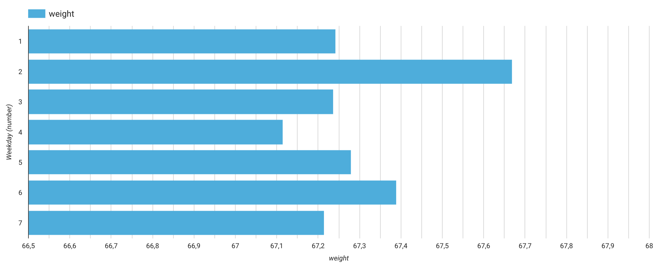
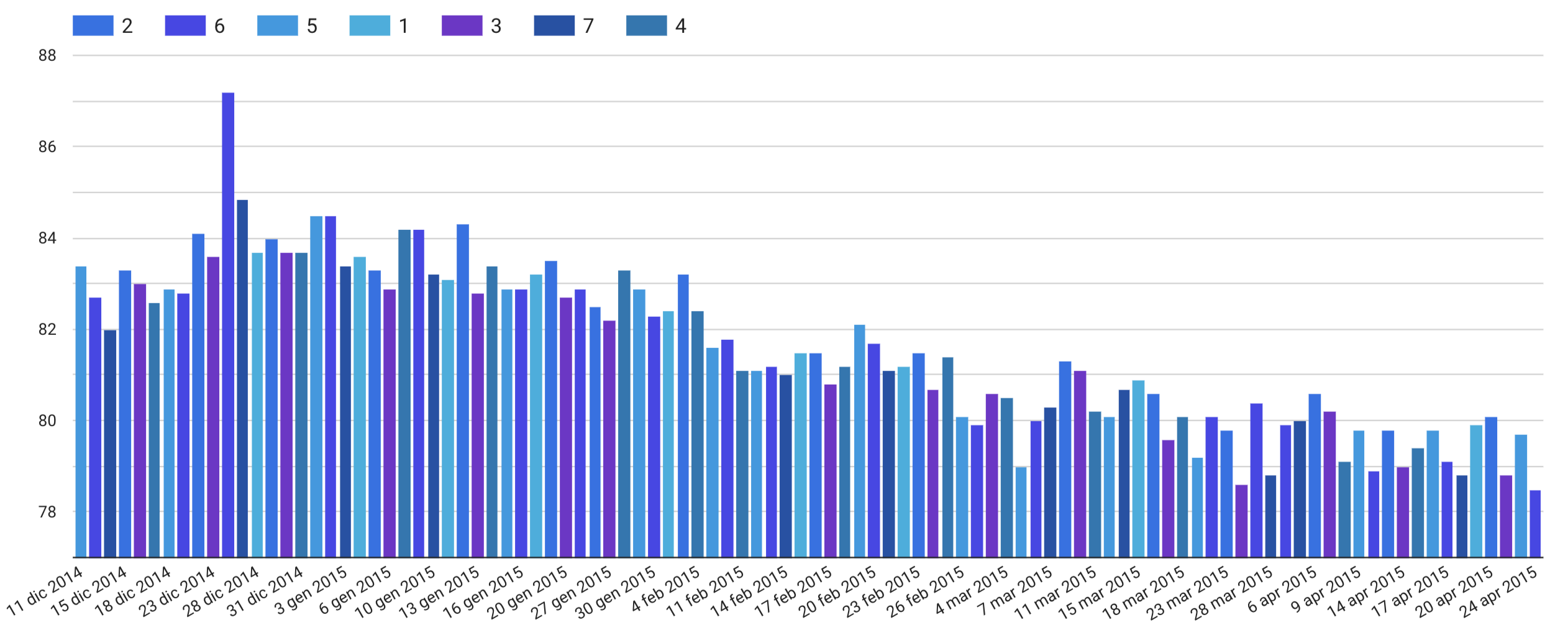
I also added an analysis to show the average weight per weekday. Being able to adjust the X and Y axis scales is a very convenient option to hilight data differences in a graph (but i’m still not sure if the weekday formula I used converts Mondays into 1 or 2). I had a doubt that 1 stands for Sunday and 2 for Mondays, so i had to goolge it to confirm. So the weekday with the highest weight average for me is Monday. Data confirms my assumption: it’s more likely we party over weekends, or dine at partent’s and so on, therefore Mondays are more likely to have a higher weight:
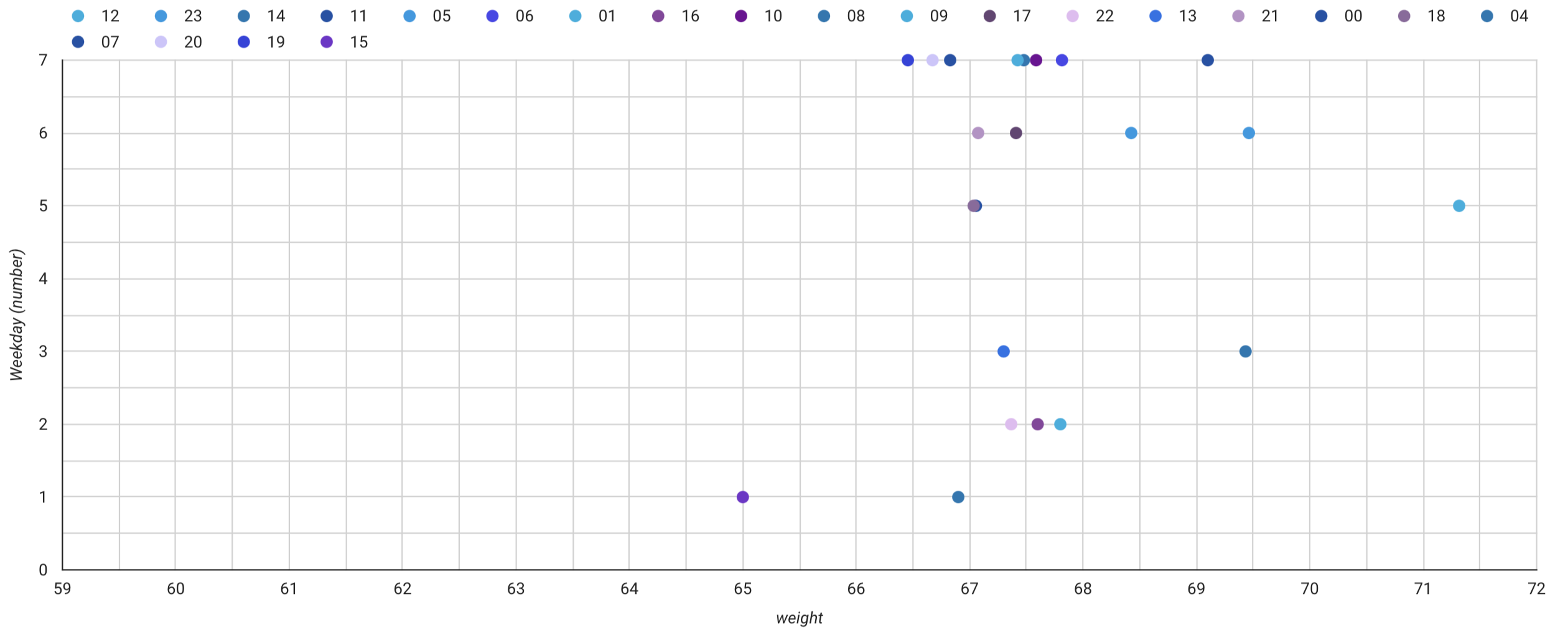
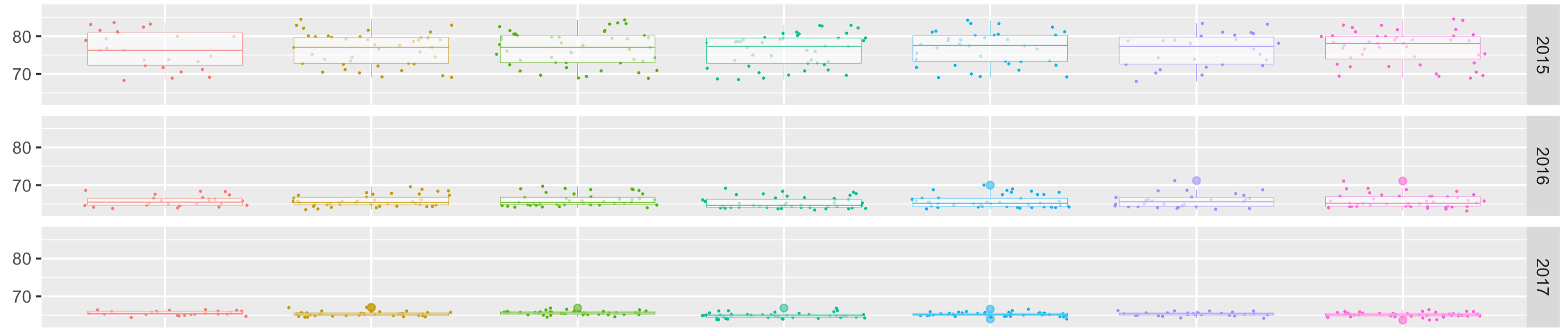
What i’m not very happy with: I tried in several ways to create a staked columns chart to explore the data by weekday (and days) aggregating all dataset into 7 different facets but with not much success. Here is some failed visualizations i came up with (nice to see but not very insightfull):
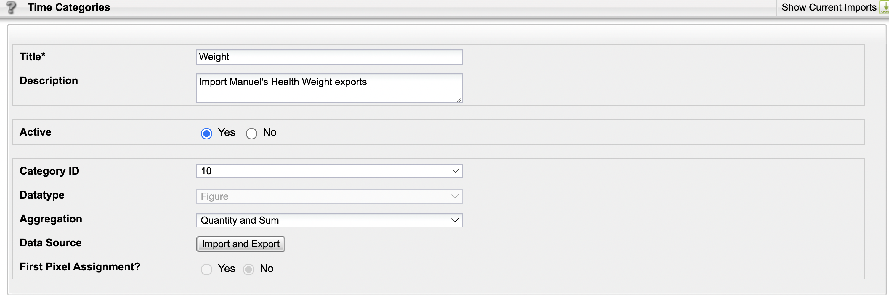
So i decided to switch for another approach: i could import my waight data into Mapp Intelligence, defining a new Time Category parameter (a KPI that can be imported into Mapp Intelligence using the TIME as key field) and see where i can get to from there. But first of course I need to define a new Time Category dimension. For clarity I called it “weight”:
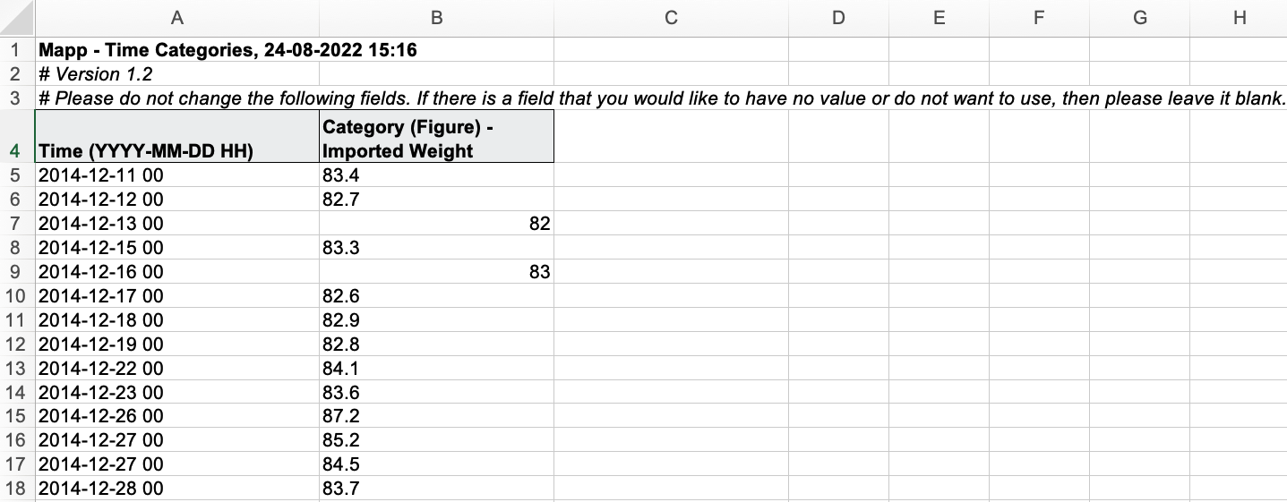
Then once created i can easily import the dataset by creating a CSV file with the needed format. Here is more data preparation task, as Mapp Intelligence requires the time column to be formatted as YYYY-MM-DD HH). Once formatted here is the input CSV file prepared for the data import:
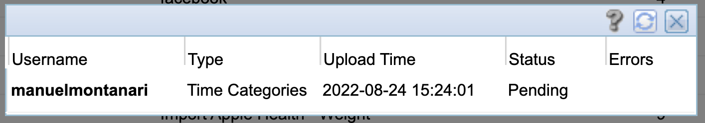
Note that here i don’t need to import any weekday value since Mapp Intelligence has a dedicated dimension already in place that derives the value from the imported time stamp. Now I need to wait for Mapp Intelligence to import the dataset. This process takes place every hour or so, since in the meantime the system processes also the Website data it is programmed to collect.
Now before using the imported data I need to specify the aggregation type for the metric. By default it is a sum, so I need to create a new one that calculates the average instead. For doing this in Mapp Intelligence I’ll simply need to create a new custom formula and save it:
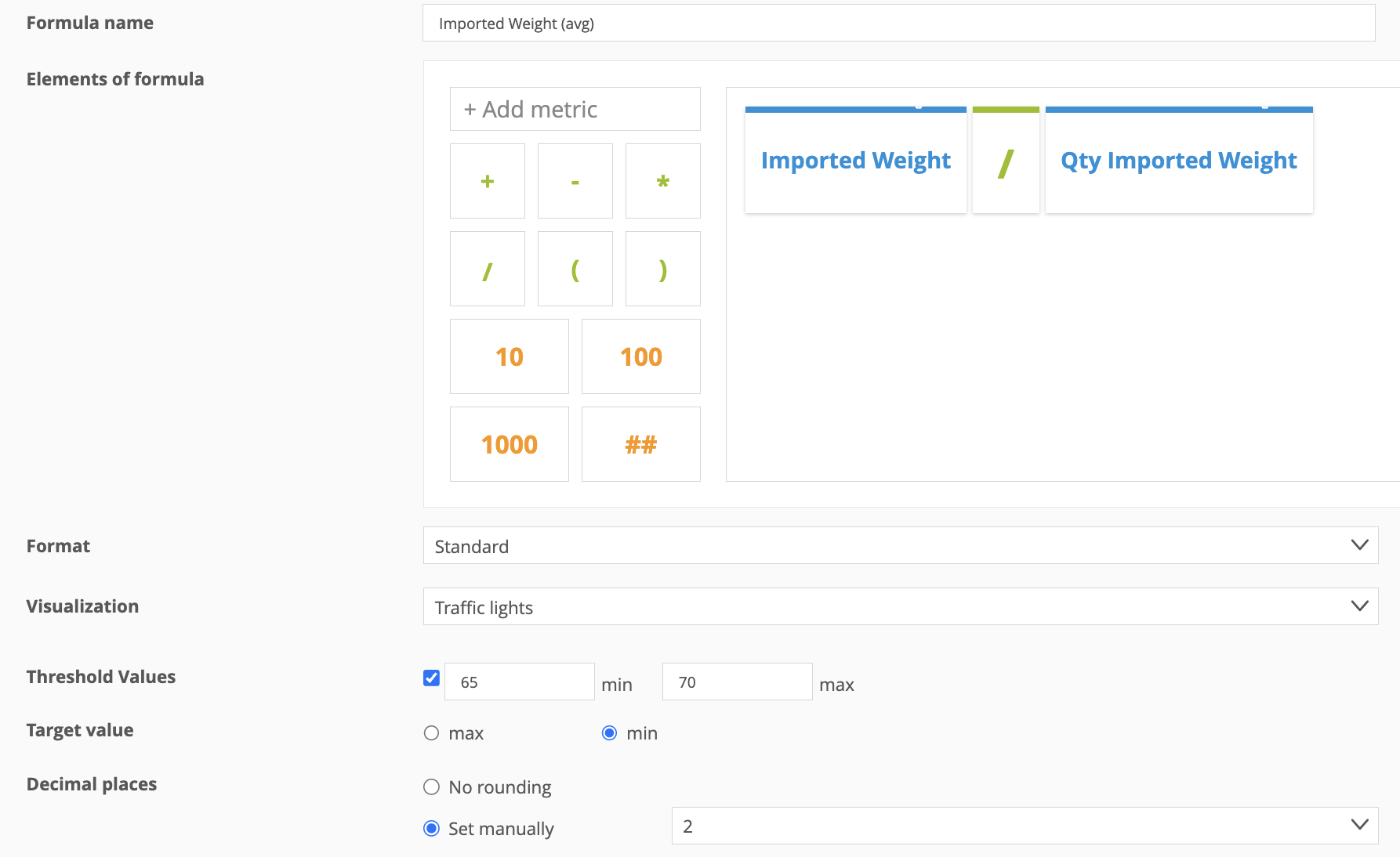
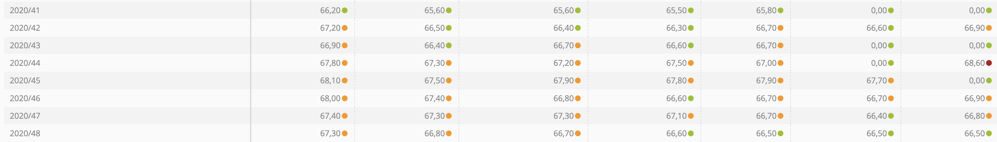
In the custom formula editor I can also specify the target value (min or max) so that the the target is green and the opposite is red in the data visualization with traffic lights when showing the data in a table:
Unfortunately with time dimensions is not possible to hide missing values or interpolate them to cover the gaps, so if they missing data really bothers me i’d have to go back to the data preparation phase and manually interpolate the missing data, or automate the task with an R or Python script, for example.
Anyways, once created the average imported weight metric, the final result for the visualization is closer to what i wanted to get: a visual heatmap of the entire dataset.
Here are some different experiments using different time intervals: this are all monthly aggregations (Y axis) split by weekdays (X axis) so that each weekday value is the average of all the same weekdays for that month, not the sum:
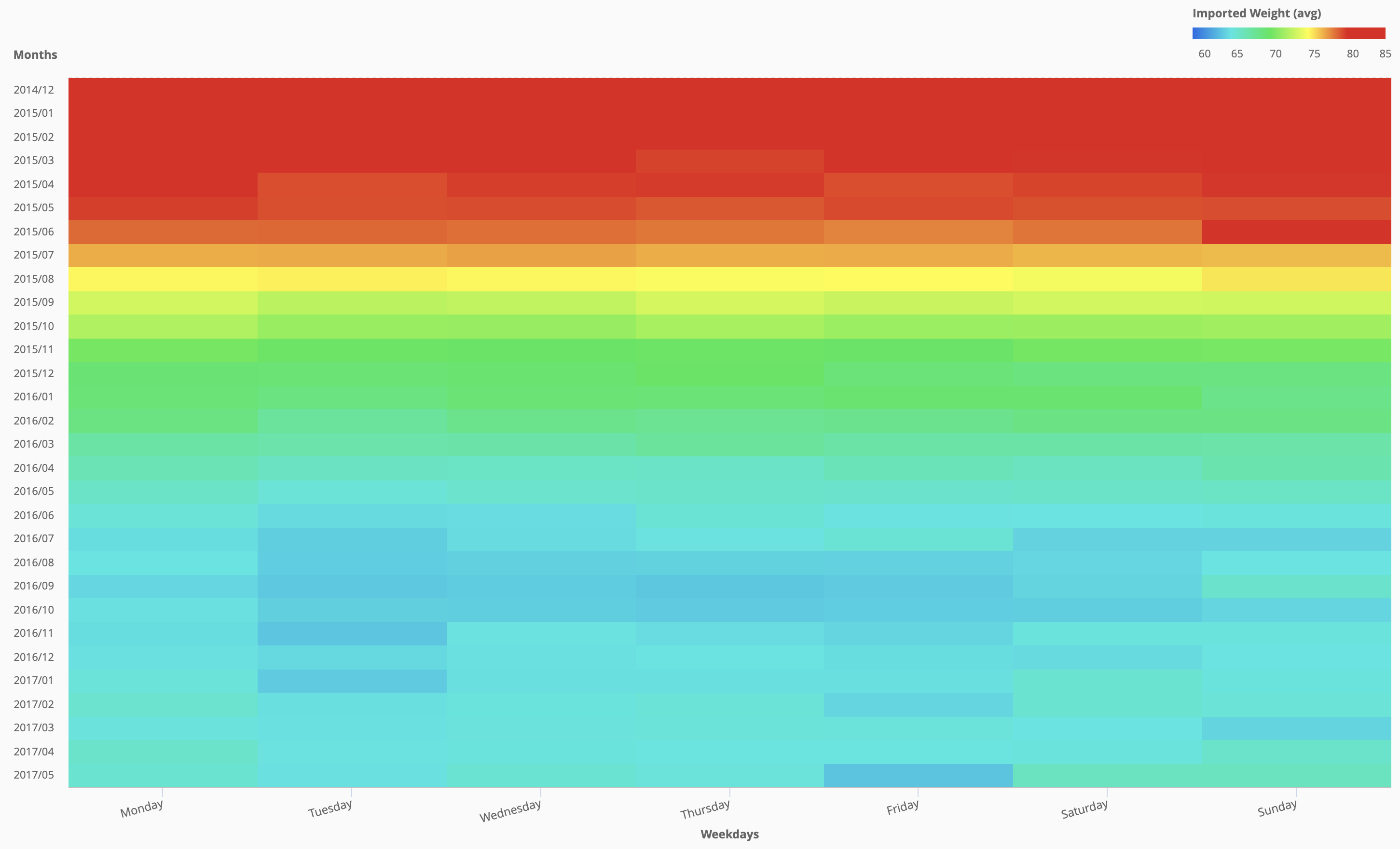
As we can see the cross-tab visualization is very useful as it automatically puts the heatmap colour in scale for the entire dataset, and we can clearly spot outliers and derive insights in a clear and visual way:
for example by looking at this cross-table we can easily spot that the “hottest” (heavy weight) months are the winter ones, especially January (after the winter holidays).
If we plot 5 years of data the pattern is cristal clear:
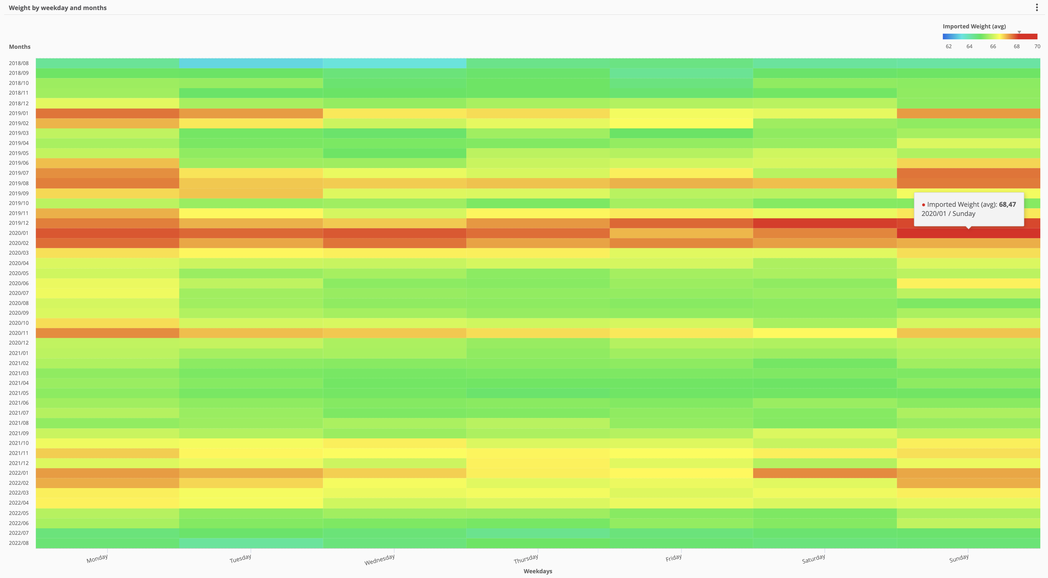
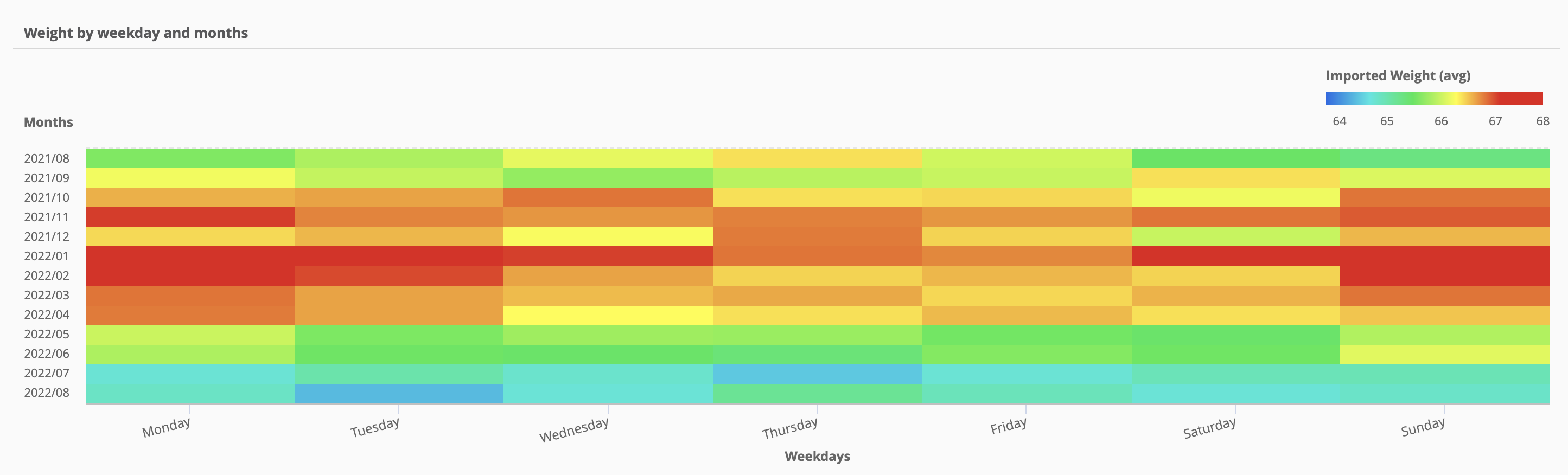
in the past couple of years the pattern has slightly changes (less parties during weekends, yes, that’s right) and less winter holidays dinners. But as we can see this graphical representation really gives a lot of insights to understand the data.
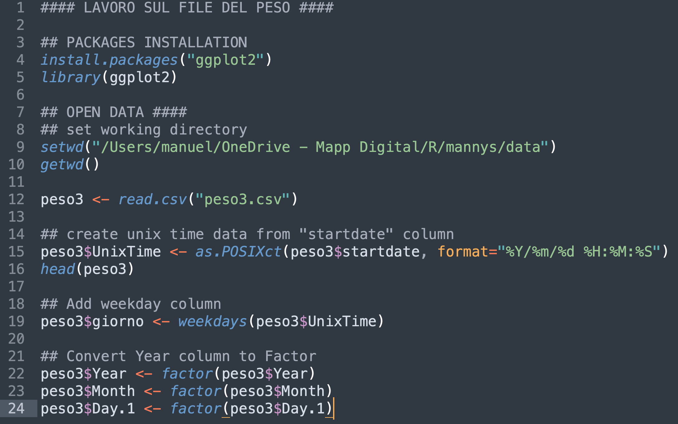
I also wanted to explore some additional data visualization in R, since some statistical approach could help as well. So i spent some time adjusting the data to an R friendly datasource:
So i wanted to plot the weight distribution by day of the week, to hilight which days have bigger or smaller variance (to find out the actual variance is not significant between 2014 and 2022):
plot <- ggplot(data=peso3, aes(x=giorno, y=peso, colour=giorno))
        + geom_jitter(size=0.1)
        + geom_boxplot(size=0.1, alpha=0.6)
        + ggtitle("Weight by Weekday and Year")
        + facet_grid(Year~.)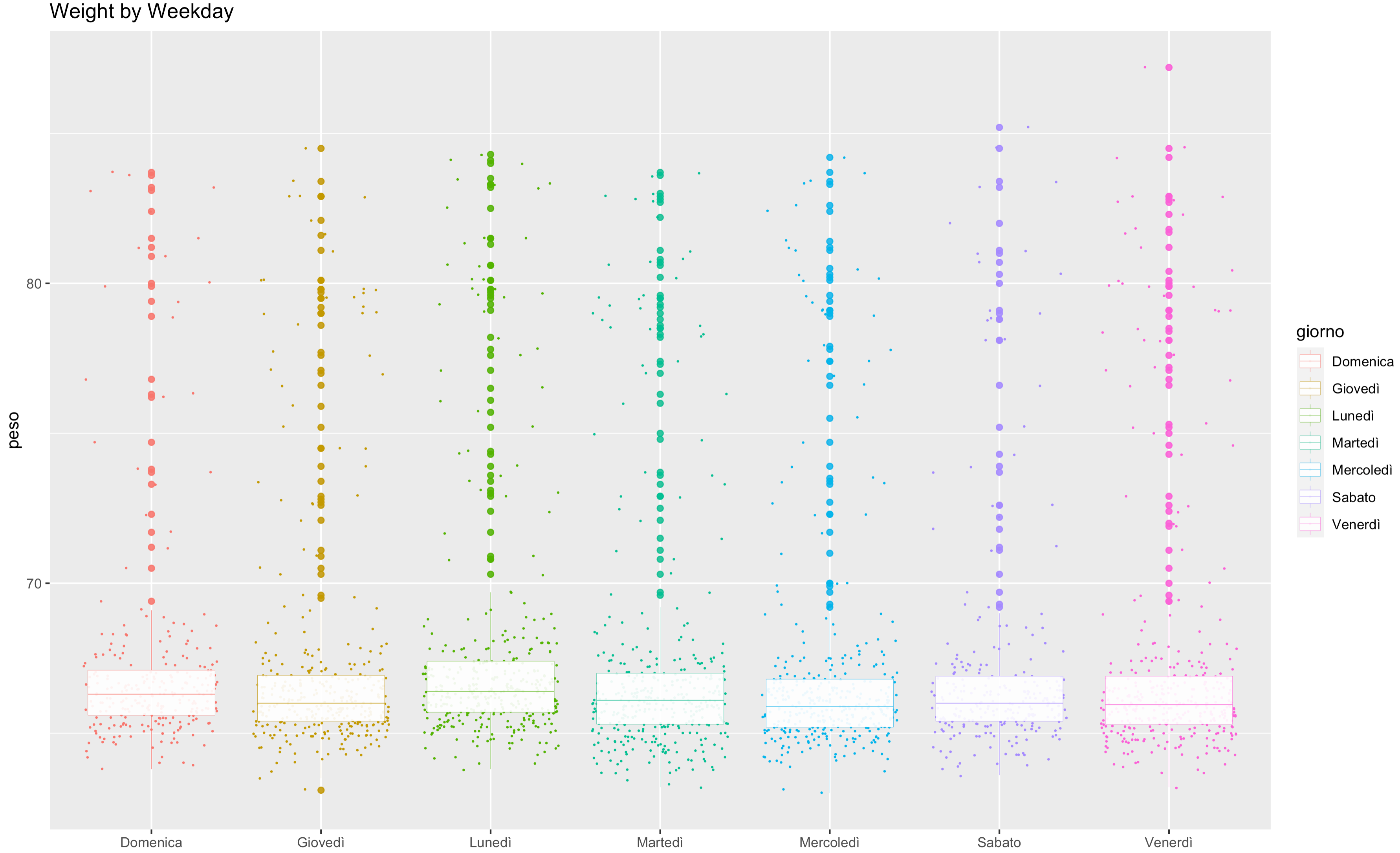
Also this visualization demonstrates how the “mondays” have an higher average weight. The interesting part is adding facets per year, so that the variance in each year can be compared:
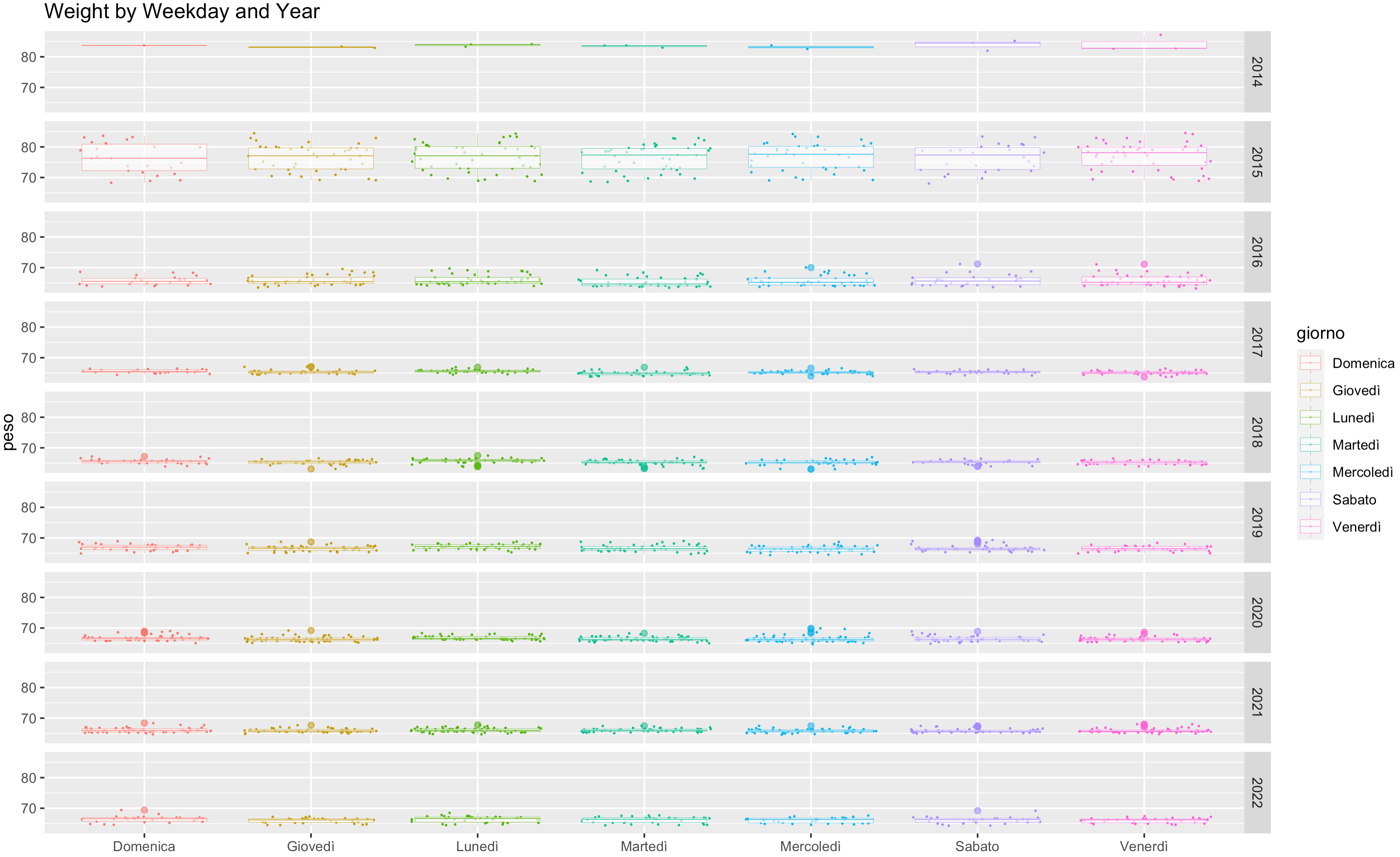
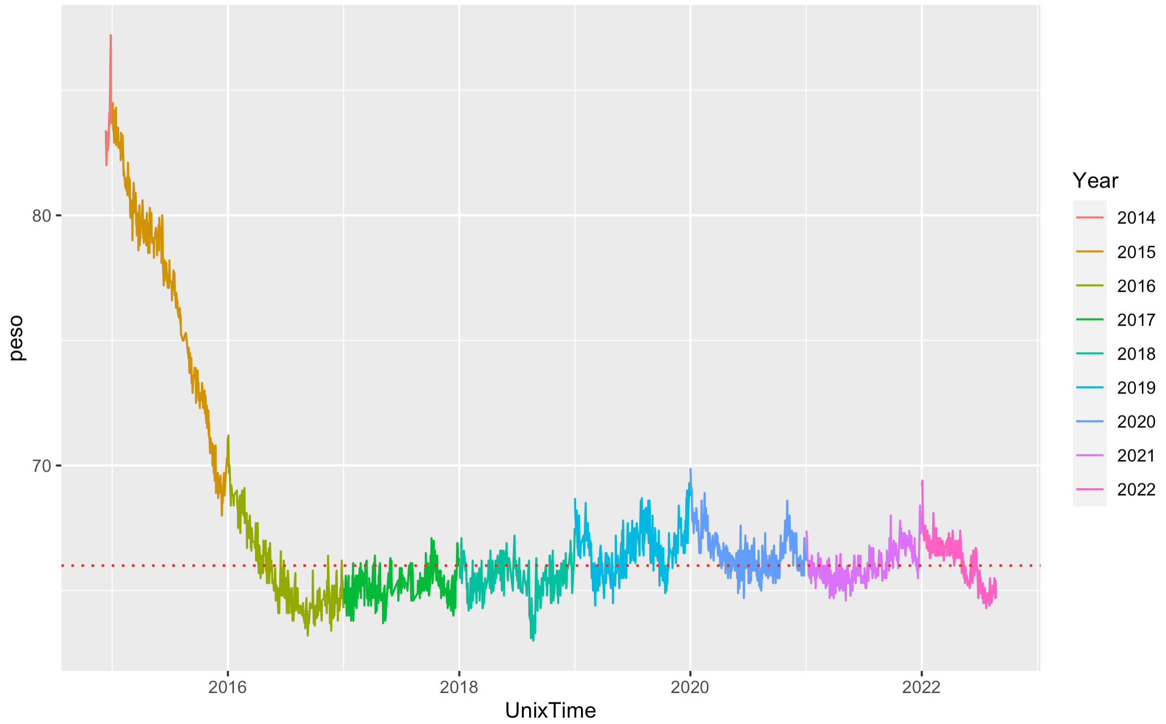
The biggest variance is in 2015, where I lost the majority of my over-weight.
Long story short, it took me about 10 hours of total work this exercise (excluding the time to write this post about it) during my summer holidays. Of those, about 7 hours were spent for data extrapolation, transformation and load, and a couple of hours experimenting with visualization methods. This means in my case 70% of the time was spent in data preparation and 30% in analysis, however i did have to experiment a bit with some features i was not alerady familiar with, therefore i assume that next round it would probabily be more aligned to the 80/20 split that is belived to be the average.
The next chapter for this analysis should be adding the steps information to the dataset and using that as secondary KPI to find correlation between weight-loss and number of daily steps, for example and see if there is any correlation. Remembering that correlation does not mean causality, but i’ll leave this topic for a future series of posts about cognitive and data biases. Stay tuned since next monday!!!
Have a good week and happy analysis!